

The Best Text Spacing Settings for Website Accessibility and Readability
When you open a website and see a solid wall of text, your first instinct is likely to close the tab and find a new source for what you’re looking for. For most users, "cramped" text isn't just a minor annoyance—it’s a barrier to understanding. Whether someone is reading on a small mobile screen, dealing with eye strain, or living with a visual or cognitive disability, the way you space your letters and lines determines whether your content is actually consumed or ignored.
Improving your text spacing is one of the easiest adjustments you can make to improve the accessibility of your website. It doesn't require complex coding or hours of training. It simply requires a basic understanding of how the human eye processes information and a commitment to setting better defaults.
This guide breaks down the essential settings for accessible text spacing based on universal design principles and the Web Content Accessibility Guidelines (WCAG).
In This Article
Why Text Spacing is a Critical Part of Web Design
The Core Settings for Accessible Text
Testing Your Spacing on Mobile and Desktop
Why You Should Avoid Accessibility Widgets for Spacing
Why Text Spacing is a Critical Part of Web Design
Text spacing is often overlooked in favor of "prettier" design elements like imagery or color palettes. However, spacing is the invisible architecture that holds your content together. In the world of accessibility, we specifically look at how spacing affects readability for several groups.
For users with low vision, tight spacing causes characters to blur together.
For users with dyslexia, "crowded" lines can lead to a phenomenon where text appears to swirl or shift on the page.
For users with cognitive disabilities, a lack of white space makes it difficult to focus on one idea at a time.
Even for users without a diagnosed disability, good spacing reduces "cognitive load." This is a fancy way of saying it makes the brain work less to get the same amount of information.
When your website is easy to read, people stay longer, trust your brand more, and are more likely to take action.
The Core Settings for Accessible Text
To meet international accessibility standards (specifically WCAG 2.1 and 2.2 Success Criterion 1.4.12), your website should be designed so that users can adjust spacing without losing functionality. However, your default settings should do the heavy lifting from the start.
There are four specific measurements to focus on
Line height
Paragraph spacing
Letter spacing
Word spacing
Line Height (Leading)
Line height is the vertical space between lines of text within a paragraph. In the design world, this is often called "leading."
The Rule: Set your line height to at least 1.5 times the font size.
While many default web templates start at 1.2 or 1.3, this is almost always too tight. A setting of 1.5 (or 1.5em in technical terms) provides enough "breathing room" for the eye to return to the start of the next line without getting lost.
Be careful not to go too far in the other direction. If the line height is much higher than 2.0, the lines may look disconnected, making it hard for the reader to realize they are part of the same paragraph.
Paragraph Spacing
Paragraph spacing is the gap between two distinct blocks of text.
The Rule: Spacing following paragraphs should be at least 2 times the font size.
A common mistake in web design is using a single "return" or "enter" key to create a small gap. Instead, your site’s styling should automatically apply a margin at the bottom of every paragraph. This clear visual break signals to the brain that one thought has ended and a new one is beginning. This is particularly helpful for users who lose their place easily or use screen magnification software, as it provides a clear landmark on the page.
Letter Spacing (Tracking)
Letter spacing is the horizontal space between individual characters.
The Rule: Letter spacing (tracking) should be at least 0.12 times the font size.
In most cases, you should stick close to the default setting provided by a high-quality font. However, you must avoid "negative" letter spacing at all costs. Pulling letters closer together to make them "fit" a certain design makes the text illegible for people with visual impairments. If you have chosen a font that is naturally "tight" or "compressed," you should manually increase the letter spacing to ensure each character remains distinct.
Word Spacing
Word spacing is the gap between each word in a sentence.
The Rule: Word spacing should be at least 0.16 times the font size.
Like letter spacing, word spacing is usually handled well by the font designer. But if you are using "justified" text (where the text is flush on both the left and right sides), it can create irregular gaps between words. These gaps, sometimes called "rivers of white space," are incredibly distracting and can make text nearly impossible to read for people with various cognitive disabilities.
For the best accessibility, always use left-aligned text.
Testing Your Spacing on Mobile and Desktop
Accessibility settings aren't a "set it and forget it" task. You need to see how these spacing rules behave across different devices.
Desktop Review
On a large monitor, look for "line length." If your lines are too long (more than 80 characters), even a 1.5 line height might not be enough to help the eye find the next line. Keep your text containers narrow enough to be comfortable, and ensure your spacing looks consistent.
Mobile Review
This is where many designs fail. On a narrow phone screen, a large heading that looks great on a desktop might wrap into three or four lines. If the line height for that heading is too tight, the letters will physically overlap, making the title unreadable.
When testing on mobile, look for:
Headings where the bottom of one letter touches the top of the letter below it.
Buttons where the text is so close to the edges that it feels difficult to tap.
Paragraphs that look like a solid wall of gray because the screen is so small.
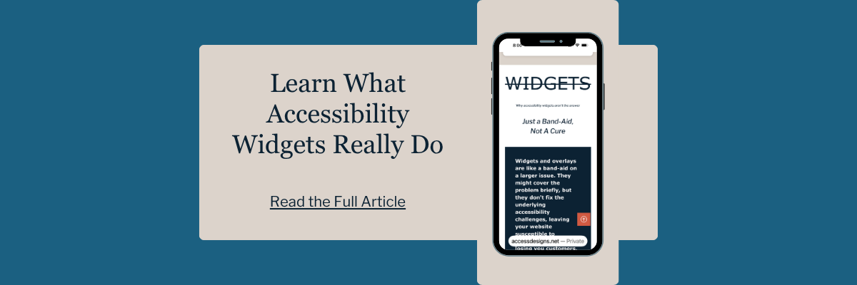
Why You Should Avoid Accessibility Widgets to Correct Spacing
You may have seen "accessibility overlays" or "widgets" that promise to fix text spacing with a single click. These are small icons in the corner of a website that allow users to change font sizes or spacing, among other settings.
While these tools might seem helpful, they are often a "Band-Aid" solution that ignores the root problem. Many of these widgets do not play well with screen readers and can actually break the layout of a website when activated.
A truly accessible website doesn't force the user to "fix" it using a third-party tool. By setting your default line height and paragraph spacing in advance, you are providing a better experience for everyone from the moment the page loads.
Summary of Best Practices
If you are updating your website today, start with these three steps
Change your body text line height to 1.5. This is the single biggest improvement you can make for readability.
Ensure there is a clear gap between paragraphs. Aim for a margin that is double your font size.
Check your headings and buttons on mobile. Make sure they have enough space without overlapping or feeling too crowded.
These settings might feel "loose" at first if you are used to tight, compact designs. However, give it a few days. You’ll likely find that the extra space makes your website feel more professional, more modern, and—most importantly—more welcoming to every visitor.
**IMPORTANT NOTE
Before making any adjustments, take note of what your defaults are currently set at.
If you need to make a significant change, it could make everything look a bit wonky on your website.
So, make sure you will have enough time to go through and adjust any text that needs it.

We helps small businesses build websites that are accessible, clear, and easier for EVERYONE to use from the start. If you want a professional review of your site’s accessibility, we’d love to take a look.
Frequently Asked Questions About Text Spacing
Does text spacing apply to all fonts?
Yes. While some fonts have different "x-heights" (the height of the lowercase letters), the 1.5 line height rule is a safe universal standard. If you use a very stylized or thin font, you may actually need to increase the spacing even more.
Will 1.5 line height make my website too long?
It could make your pages longer, but that is not a bad thing. Modern web users are very comfortable with scrolling. They are much less comfortable with squinting. Prioritize readability over page length every time.
Is "justified" text okay if I use the right spacing?
No. Avoid justified text (where both edges are straight). It creates uneven spacing between words, which is a major barrier for readers with dyslexia and those using screen magnifiers and screen readers. Always stick with left-aligned text when possible.
What is the difference between line height and paragraph spacing?
Line height refers to the space between lines within a single paragraph. Paragraph spacing is the vertical gap between two different blocks of text. Both are essential for keeping your content organized and readable.
Should I use the same line height for headings and body text?
Not necessarily. Because heading fonts are usually larger and bolder, they often need a slightly tighter line height than body text to look visually balanced. However, you must still ensure they don't overlap when they wrap to multiple lines.